Prepare Effective Airport Management Dashboards
(April 8, 2016 by Dafang Wu; PDF Version)
This article discusses considerations when preparing airport management dashboards, and introduces business intelligence (BI) software as an interactive tool.
Airport executives rely on well-organized, timely, and accurate data to make informed decisions. However, many management dashboards are prepared as data reports, requiring airport executives to spend a tremendous amount of time analyzing and digesting them. Effective management dashboards could free airport executives from tedious analyses, enabling the airport leaders to concentrate on critical issues at their airports.
Preparing Management Dashboards
Preparing an effective management dashboard involves the following considerations: audience, content, presentation, and process.
Consider the Audience
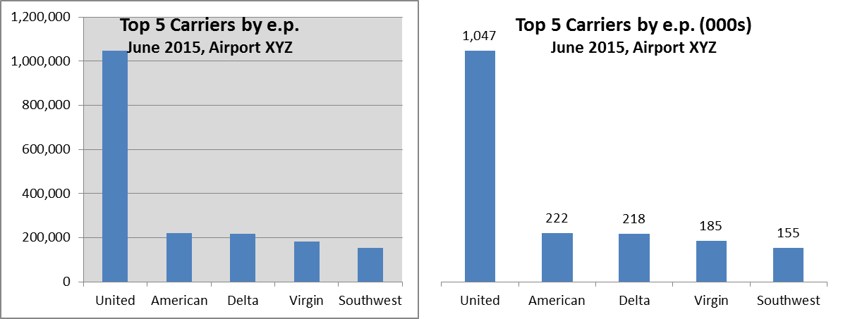
The audience of airport management dashboards is airport executives, who would prefer to spend time fighting for an increase of the Passenger Facility Charge level instead of punching keys on a calculator to figure out growth rates. This consideration determines that a management dashboard should exclude unnecessary details. For example, precise numbers may not be necessary, and charts can be used unless presenting numbers is more efficient.
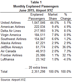
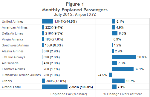
Table 1 is a typical table included in airport monthly traffic statistic reports; it lists the numbers of enplaned passengers by carrier. It is widely used by external consultants and analysts for further analyses, so it presents detailed numbers for each carrier, including those that may have a passenger count of a single digit. Figure 1, on the other hand, is a chart designed for management review, graphically presenting each carrier’s market share and performance compared to those of the previous year.
 |
 |
Include the Right Content
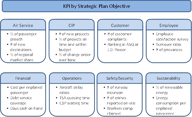
The purpose of a management dashboard is to present information and identify issues critical to airport operations. Therefore, it must include key performance indicators (KPIs) that allow management to evaluate the overall health of an airport. A good place to start is an airport’s strategic plan and the related action plan. The following figure presents an example of strategic plan objectives and sample KPIs, although those KPIs must be selected to reflect the airport’s reality, such as for airports using a residual airline ratemaking methodology versus those with a compensatory methodology.
Design the Presentation
Most charts in a typical management dashboard are produced in Microsoft Excel, which is the most frequently used software for financial analysis. Microsoft Excel provides a large list of available chart types, but not all the charts are proper for reporting purposes. Because we are presenting numbers to convey a message, any information that does not assist our purpose should be removed.
There is a set of general rules when presenting numbers. For example:
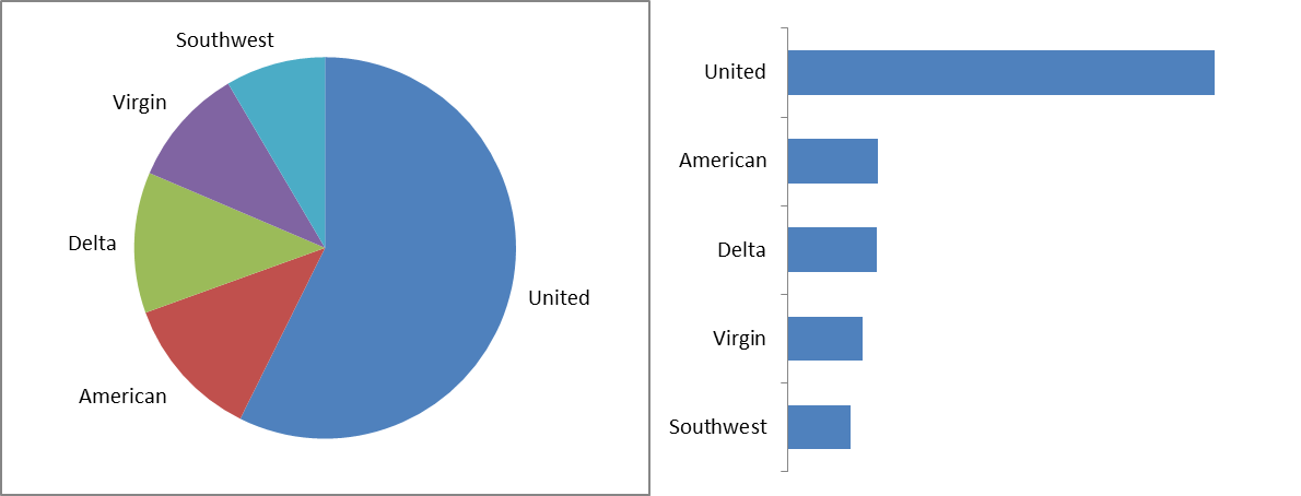
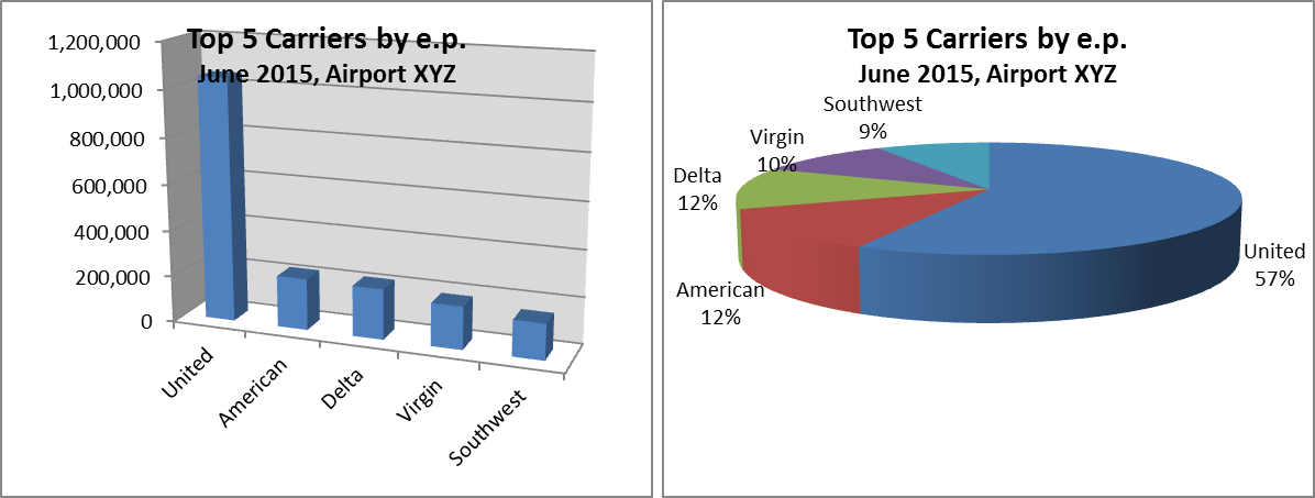
- The appropriate type of chart should be used. For example, pie charts should not be used because human eyes cannot detect the exact size of a 2-D or 3-D object. Although the two charts below do not show any numeric value, we can still determine the ranking from the bar chart, even if the difference is relatively small.
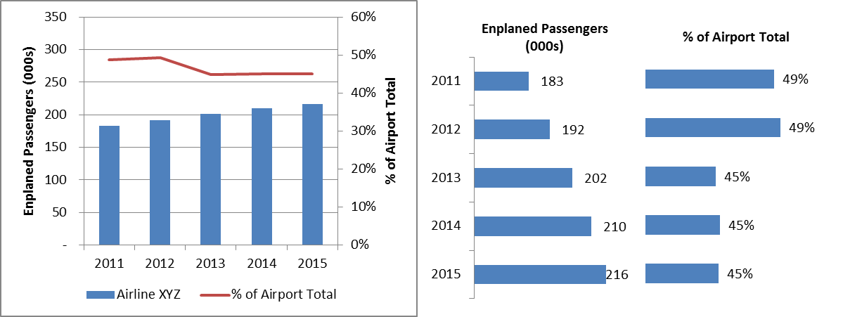
2. An optimal data-ink ratio should be achieved. Data-ink ratio refers to the ink that must be used to present the numbers divided by the total ink on the chart. Consider the following two charts:
3. Considering the two rules above, we should not use 3-D charts for data presentation.
4. If we cannot tell the purpose of a chart in 10 seconds, we may redesign the chart to be a more simple one or use multiple charts.
Presenting numbers effectively is becoming a skill that can be learned. Stephen Few is one of the leaders in data visualization and has published several books, such as Information Dashboard Design.
Streamline the Process
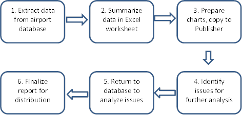
If a management dashboard needs to be published on a regular basis, streamlining the process can reduce staff workload. The following chart illustrates the process of a typical management dashboard.
The Business Intelligence (BI) software provides a possibility for simplifying each step of the process and for greatly reducing staff workload through the following functionality:
- The BI software can eliminate step 1 and link directly to data sources, including CSV files, Excel worksheets, SQL, MySQL, Oracle, Google Analytics, Saleforce, SAP, Teradata, and almost any other data sources.
- The BI software can eliminate step 2 because it automatically aggregates information into a useful format.
- The BI software greatly simplifies step 3. After the dashboard (the front-end) is designed, it requires minimal maintenance, while the charts prepared in Excel must be adjusted from month to month.
- The BI software can highlight issues for analysis based on predefined rules (e.g., highlight revenue categories that are declining year to year), but can’t replace a human when critical information exists outside the data system (e.g., traffic declined due to more snowstorms this year).
- However, the BI software is an excellent analytical tool in addition to being a data presentation tool. It provides a convenient way for the staff to drill into details and analyze any issues before presenting them to airport executives, which is further discussed below.
- The BI software provides a range of distribution solutions. Dashboards prepared in Tableau, the BI software discussed in this article, can be distributed via the following:
- Emails. The Tableau file, with all related data extracts, can be emailed. A free Tableau reader is available online.
- Tableau Public, where any users can publish a non-confidential Tableau dashboard for free on Tableau’s website and link to their own websites. Https://dwuconsulting.com provides a Tableau Public dashboard on its homepage.
- Tableau Online, which is a secure solution hosted by Tableau. Users can access confidential dashboards online for a low annual subscription fee. It does not require any support from the IT department. Both Tableau Public and Tableau Online function well on smartphones, tablets, and personal computers.
- Tableau Server, where a large organization can purchase a server version and realize additional functions.
Explore Strength of BI Software
In addition, Tableau has many advantages over Excel regarding preparation of management dashboards.
Charts and Tools
Tableau offers many new charts and tools, which are easy to prepare.
Map
For example, the following map presents the total departing seats from U.S. airports in the second quarter of 2016, and the percentage change from the second quarter of 2015.
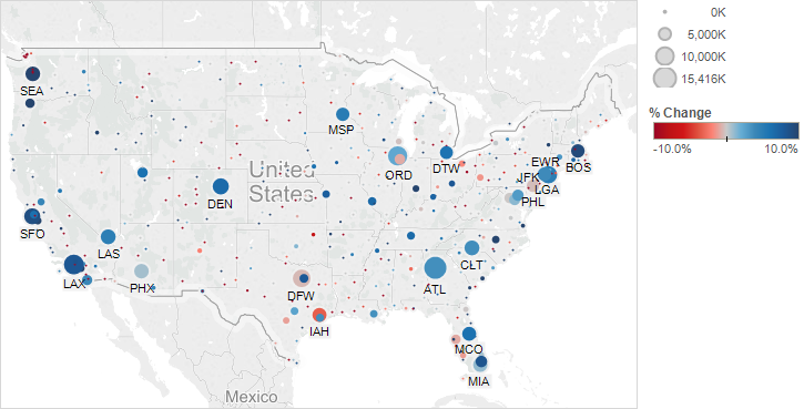
Tableau can also dynamically link to external maps or sites, such as Google Maps, project schematic design, project pictures, or websites.
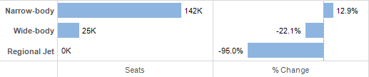
Bullet Chart
A bullet chart is a new type of chart that visually presents a number compared to another. For example, the following bullet chart shows that annual operating expenses are lower than the budget.

If needed, different colors can be used to show 60% and 80% of the annual budget, as shown below.

Gantt Chart
Tableau can instantly switch data in an Excel file to a Gantt chart, such as a gate occupancy chart, to allow us to visually inspect utilization and available slots. The follow chart shows the actual flight activities for a gate during a 24-hour period.

When an alternative scenario is needed, we can modify the underlying Excel file. Any changes will then be reflected in the chart.
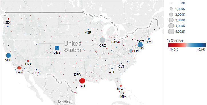
Interactive and Drill-Down Capability
Tableau is an interactive tool with a great drill-down capability. A printout of a Tableau dashboard is like the cover of a book, providing valuable information but not all the content. For example, the dashboard printed on the cover of this brochure shows a summary of departing seats in the U.S., and the online version on https://dwuconsulting.com allows us to drill down to see any line of the 344,000 rows of underlying data.
For example, this chart shows the departing seats for only United Airlines.
When we specify DEN to see which destinations United Airlines serves from DEN, the dashboard will present the following table.
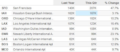
If we are interested in seeing equipment types on the DEN-IAH route, we can click IAH in the table above.
A similar dashboard can be prepared for any aspect of an airport’s operations, especially for any operation that has a large and complicated set of data, such as revenue, expenses, capital spending, capital budget, and parking transactions, among other data. Https://dwuconsulting.com provides many useful online examples with full function.
Conclusions
Tableau is a powerful business intelligence software program and has the ability to greatly reduce staff workload in preparing the management dashboard. However, it can identify and analyze issues, but cannot solve a problem. Eventually, the task for all airport executives is to inspire their staff to explore better ways of managing their airports; every staff member is talented, albeit in different aspects.